
“ENDANGERED SPECIES” reads across a blank white poster in bold, black letters. The concept seems simple at first, but the meaning behind it represents a much more complex issue.
“As you go along the word, you notice that each ‘E’ gets lighter and lighter until the last ‘E’ is still there but it’s barely there to represent how species are fading away,” said junior musical theater and graphic design double major Alexander Capeneka.
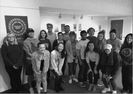
Capeneka created this poster as part of the “Environmental Awareness from A-Z” display organized for the first time through Associate Professor of Art and Design Brit Rowe’s introductory visual communication design course this semester.
The course focuses on typography, which is the art of arranging type. Rowe said that he specifically addresses typographic history, or why type looks the way it does, at the beginning of the semester. He then talks about classification of type and finishes with a discussion on typographic form, which provokes several in-class exercises.
Through this project, students chose two letters of the alphabet that each stood for a particular environmental issue. They then conducted research on their issue, presented their findings in class and created a typographic poster based on their research.
Capeneka worked on the letters ‘E’ and ‘N’ to stand for endangered species and noise pollution, respectively because he felt that he had many ideas in terms of design regarding these topics.
However, having a lot of ideas is not a concept that he has always embraced.
“Through each project, I feel like I’ve been really learning how to not reject any ideas before the idea is presented,” Capeneka said. “Before, I used to always be one to think ‘oh, that’s probably not going to be a good idea’ so I wouldn’t even try executing it in any way and I’ve kind of learned to let that go, which is nice and I think it helps strengthen the creative process.”
He believes that Rowe does a nice job emphasizing this approach in class through his presentations and also by encouraging students to go beyond creating the minimum number of sketches prior to working on the project.
Rowe tries to motivate all of his students to produce the best work that they can, whether it’s through creating sketches or acquiring information on a certain topic. One of the most challenging aspects of the project, was getting students to become experts on their particular environmental issues.
“I really hope that our students also become aware of not just ‘oh, I have to make things look good,’ but there are also things that, in order to be a good graphic designer, you have to know about,” he said. “It’s kind of like being an English major– to write something you really have to know something well. That’s the challenge.”
The ONU graphic design program encourages its students to be well-versed in a variety of topics, one of which addresses the environment.
“One of our basic missions is that we want students to be graduating from our program that are consciously aware of sustainability and environmental issues relating to their work, and their work’s impact beyond just their everyday use,” Rowe said.
He explained that pushing students to think beyond the superficial implications of their work and to address why their audience should care about each topic was another challenge of the project. Rowe wasn’t sure how his students would respond to the assignment because of these challenges.
“For the first time doing this project, I was a little worried,” he said. “I thought it may be too complex or [asking to] get too much done in a short amount of time.”
But he thought the project had a desirable outcome in the end. Two major productions have occurred in the performing arts center since the exhibit went up in early October, but Rowe has not observed any outside commentary regarding this outcome. The posters will be displayed adjacent to the Freed Center lobby tentatively until Nov. 17 for audience members to evaluate, something Rowe believes is important.
“We are, for the most part, a very visual culture,” Rowe said. “We like to look at images quickly and make an opinion right away, but also at the same time, we are a visually illiterate culture, that we don’t spend time to evaluate meaning and context and all these other things relating to images.” Rowe hopes that, at a minimum, the breadth of topics addressed will strike some audience members.
Capeneka agrees that the large number of issues covered is enough to make a statement. “Even if somebody walks into the space and doesn’t really look at these up close right away, but they can see all of them, I think just visually seeing all the posters up on the wall really shows that there are a lot of environmental problems that need to be discussed and we need to be more conscious about,” he said.
Consciousness of these issues are not solely dictated by the audience. Capeneka believes that the value of the project lies in his freedom as an artist to voice his opinion and make statements about each issue regardless of what the audience may take away from the exhibit.
“Not all art has a definite meaning, but I think when an artist or a designer has a specific message that they want to send through their piece, I think that’s really great, because I think everyone should find some sort of overall message that they stand for that they could really get across to their audience,” he said. “It’s just important that we have these opinions so that we can talk about them and so they don’t just drift off and nothing is done about it.”